
Onto the photo emulsion project. For this project we had to do a design with at least two photo emulsion exposures. I decided on a dragonfly theme for this project. I wanted to project to have multiple design elements. The dragonflies would be the primary elements but I also wanted to work with layering, incorporating some nature elements and words. I wanted the background and foreground to be transparent so that the dragonflies would be the focal point but you would still be able to see the background through the dragonflies, mimicking their iridescence.
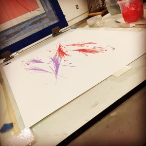
The first couple of background layers were created with random leafs and grasses with a photo emulsion process. The first screen was grasses with some ink splatters for a little more color. The inks contained about 65-70% transparent base. I thought that would be more than adequate but later I would find they were too bold and opaque.
The next layer was some leaves laid over the grasses. Again, the inks contained transparent base. The intent is to have them be visible through the dragonflies.
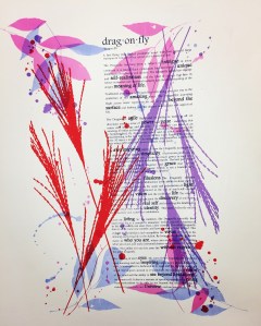
The next step was to add the paragraphs about the dragonfly imagery. This had meaning to mean as it mimics some of the life journeys that I have experience recently. The words were done with an opaque ink so that they would be visible through the focal point.

The next step was to add the dragonflies to the piece. The base color for each of the dragonflies was added. Each of the dragon flies were added individually with acetate stencils. The inks for each of these also contained transparent base, trying to get a translucent effect with the background coming through the dragonflies.
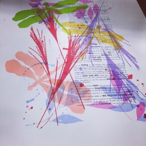
The biggest challenge for this product was trying to get varying colors in the wings and body of the dragonflies. I had a vision in my head but struggle in getting it to work with printing techniques.

The next layer I attempted to use screen filler on acetate with varying opacities trying to get the effect of a wash with a photo emulsion screen. This was unsuccessful. Very little of the stencil came through on the emulsion exposure. The screen appeared to have been successful but very little ink came through the screen.


Next I tried using toner mixed with alcohol and tusche mixed with alcohol, still trying to get a wash effect. I did a some experimenting with ratios of alcohol with the different materials and then exposed to test. The 100% tusche gave me the best results and so I went with that to create the next layer of color.
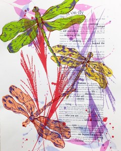
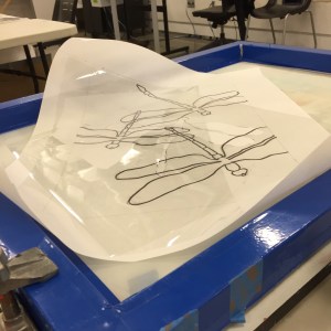
The tusche emulsion still did not give me the look I had been wanting but it did give me a little more color to the dragonflies. I finally had to settle for this look. The final layer was the matrix for the dragonflies. This stencil was a photo emulsion. It was made from an acetate stencil created with a zig pen. This stencil was very successful and was able to give me a good finish for this print.
Overall this was a great project and I learned a lot about the photo emulsion process. I enjoyed the process and some of the effects you can get. The experimentation of everythng really fit how I like to work.
Although I had to cut my experimenting short due to the time contraints of a class project, I was happy with the end result. I would like to like to experiment more with the washes with the photo emulsion.
Great project, happy creating all!
