The frst print project complete for this term. What a challenging project full of opportunities, mistakes, and successes. What more could you want out of a project. At the urging of my instrutor I did a double plate linocut for this project. Two separate plate with unregistered designs on them. This was a huge challenge for me. I had never under taken anything of this complexity. A little intimidating at first. I put away my desire to create that beautiful print and approached it from an attitude of learning and see what I could do with the double plate. To learn the possibilities and answer the “what if”.

I really didn’t have a plan going into the project other than the basic imagery on each plate. I also decided to do the reduction without any stencils or color wipe outs. I am learning that I work best that way with print. I do better when I can just react to what the press and the ink create and not get locked into something. Let creativity happen and push myself to begin yo answer the “what if”!

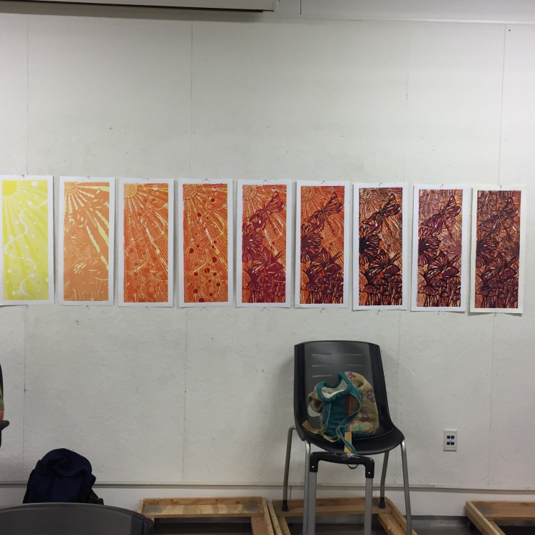
For the first run I ran the background plate. The first color was a mix of daffodil yellow mixed with white approximately a 3:1 ratio, running two prints for each plate inking and ended up with a good set of full ink and ghost prints. I ran enough prints to get a good edition, have some experimentation prints, and to have an artist proof at each stage of the print.

The next run was the first cut from the matrix plate. I cut the sun imagery from both plates in a similar manner so they would compliment each other. The seond color was a combination of magenta, daffodil yellow, white and transparency. The color was approximately a 1:2:2 ratio respectively and then about 40% transparency. I have to admit I wasn’t sure what to think about the imagery at this point. It seems like it is at least the thrid or fourth reduction before the imagery starts to show itself.

For the thrid color, I went back to the background plate and continued developing the sun ray imagery. The color for this run was a little deeper orange. I used magenta, daffodil yellow, and transparency. The color mix 1:2 ratio respectively with about a 40% tranparency.

The fourth color was a continuation of the background plate. For this reduction, most of the plate was reduced with only a few circles and some of the plate “noise”. That’s probably not the printmaking term but that what I call the random inking you can get when very little of the plate remains. I am learning how to make the “noise” intentional. This color was magenta and transparency 1:1. I went a little heavy with the transparency know that pure magenta can take over if you are not careful, or that has been my experience, anyways.

The fifth color was the start of developing the matrix and final imagery. The body of the piece was finally starting to develop. The color for this run is a red violet. The color was made with magenta, process blue, white, and transparency, 2:1/2:1 respectively.


The sixth color is finally here. This run and then the image matrix. The color for this run is a blue-voilet. I used magenta, process blue, white, and transparency for this color. The color mix is 2:1:1 and 40% transparency.
The final color was a deep purple. I am not normally a fan of black. It has it’s place in printmaking from time to time. The final matrix color was a mix of magenta and process blue, approximately 60% magenta and 40% process blue.


Throught the entire process I used some of my proof paper to clean the plates. Why waste ink right? The final paper from cleaning the plates has some potential too. Future print project or collage maybe?….

What a fun project this was. I learned more about color and the possiblities of the “what if”. Overall, the registration went well and I’m happy with the imagery I got with the double plate. The double plate offers another level of possibilites. I think my biggest challenge was how the colors affect each other. Color seems to be one of my biggest challenges with printmaking. My understanding of color grows with each project. I pushed myself to answer the “what if”.